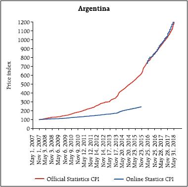
I would like to start by expressing my deepest gratitude to the Reserve Bank of India for inviting me to give the 2nd Suresh Tendulkar Memorial Lecture. Professor Tendulkar was one of the most influential policy makers in India, and among the many things he did, he served as the chief for the National Statistical Commission in India. One of the objectives of such commission was to reduce the data collection problems faced by the national statistical authorities. It is only fitting then, that I will spend all this lecture talking about measurement and data collection. So, for those that thought I was going to talk about the US, and what is going to happen to the US interest rates, that is happening next door; here it is all about the absolutely boring and extremely tedious life of those of us who are devoted to data collection. It is a great honor for me to be here giving this very distinguished Lecture. I am humbled by your invitation. Additionally, this is the third time, I have the pleasure to visit the Reserve Bank of India, but the first one where we are not watching the Cricket World Cup. I have to say, I am a little bit disappointed. So, we have to make sure I am here in 2023 when it actually takes place in India, and there can not be any excuses. Let me start by recognising one of the characteristics that defines me as a researcher. I am absolutely obsessed with measurement – the last 17 years, I have spent my life thinking about measurement. Why? primarily because I feel we do a lousy job at it. Let me be more precise. We use a framework at Sloan in my classes to discuss the dimensions that matter for social well being and the problems of measurement we have. We call it PROMISE. Where PROMISE stands for Personal, Relationships, Organisations, Markets, Institutions, Social and Political, and the Environment. When you think about it, all these dimensions matter at the moment of evaluating well being in any society. We cannot forget one and pretend everything is okay. One of the applications is that we use this framework to understand what are the principles of what make a particular dimension sustainable. For example, in terms of pollution, we would like the pollution that we add into the system to be smaller than the one we can take out. The second important application, is to highlight the quality of how we measure. 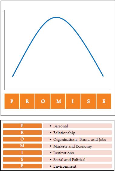 As I said before, I believe we do a horrible job of measuring. For example, we do not measure the quality of relationships; mostly when they breakup. We do not measure the degree of satisfaction of our labor force (or their morale); mostly when they are upset and quit or file complains in labor courts. We do not measure how upset a society is; mostly observe when they are rioting. We do not measure the impact we have in a particular lake; mostly when the lake is lost. We do not measure the consumption of drugs, only count the number of people that suffer an overdose. Of course, economic outcomes are some of the ones we measure the best, but as we get far from purely market outcomes, the quality of our measures deteriorate. I believe the “bad” measurement has five characteristics: We measure Late, Infrequently, almost always concentrating on Extreme Behaviour, basing our assessment in Perception, and obsessed on the wrong Statistic. So, I think that if we make good decisions it is mostly a miracle – clear evidence that some divine entity is protecting us. For example, how do we measure women empowerment? We count the number of women or count the cases of sexual harassment. First, filed “sexual harassment cases”? that is the definition of, too late. Second, counting them after the court case has become public (infrequently). Third, sexual harassment is the extreme realisation of a hostile environment. Fourth, we only pay attention to the cases that make the news – have you heard the cases in colleges that were rampant in 2015? Have you heard any case lately? I do not remember a single case in 2018. Does that mean that there are no more problems, or that the newspaper is distracted with scandals in Hollywood? Finally, by concentrating only in court cases, we are going to make sure less cases occur, but we will do nothing to change the hostile environment in which most women have to navigate. My research is trying to understand what we can do to ameliorate the problem of measurement in all the dimensions of PROMISE. It is a broad and messy agenda; and probably it will not be finished in a lifetime. I would like, at least, to show some of the things we could do. Imperfectly measuring the relevant Let me start by clarifying what are the principles behind all the measurements that we are exploring at Massachusetts Institute of Technology (MIT) – I call these the pillars of ‘modern measurement’. First, on the data collection there are two guiding principles: First, in order to produce timely indicators, we need to measure in a continuous manner. Second, the data collection needs to be non-intrusive, or at least as non-intrusive as possible. This means that, very likely, the data collection has to be electronic. It is the only form of data collection where we could collect rapidly with minor disruption. The next two principles are related to the dissemination of the indicator: first, the methodologies need to be open source, and the individuals, firms and communities measured should be able to have a clear and open procedure to deal with discrepancies or appeals. Second, the data release needs to protect privacy. Right now, because our statistics are produced with significant delay and very infrequently, we feel that aggregating the data is enough to protect privacy. However, once the data is released in almost real time, aggregation is not enough to protect privacy. Other more sophisticated procedures of privacy preservation need to be implemented. These four principles lead to the last characteristics of the modern measures – they will be, by construction, imperfect. I am not worried. I actually think, it is much better to imperfectly measure something relevant, than to continue to perfectly measure the irrelevant. In order to accomplish this new measurement principles, we need new data sources – and very likely new procedures. According to Bob Groves (the former head of the US Census) there are two general data sources: designed data and organic data. The second one being what most call “big data”. So, I guess the first one is what should be called small data. Designed data is the data that comes from surveys and administrative records. Surveys have a purpose or a question, and the questionnaire and data collection are designed to answer such question. In this perspective, administrative records are a form of survey. The Census is a survey, financial statements are surveys, tax forms are surveys, etc. All those have different objectives: to count the number of individuals in a country, to understand and compare the financial situation of firms, and to understand the tax liability of an individual or a firm, respectively. We ask individuals and firms to fill the information in a particular way, and then the national statistical office produces information that is shared with the country. In the end, the advantage of the designed data is that it is representative, there are small sample selection problems, it is well understood, and therefore, it is clear how to cure it, and because of its infrequency, aggregation tends to be enough to protect privacy. On the other hand, the disadvantages are that the data collection is costly, and that the surveys are extremely intrusive – so much that response rates have been declining in recent decades and people find the surveys such a burden that they are not necessarily answering truthfully. One example is going to be the citizen question just added to the Census. The Department of Commerce made a mistake and the proportion of bad responses we are going to observe in the 2020 Census will increase. What a waste of time and effort. 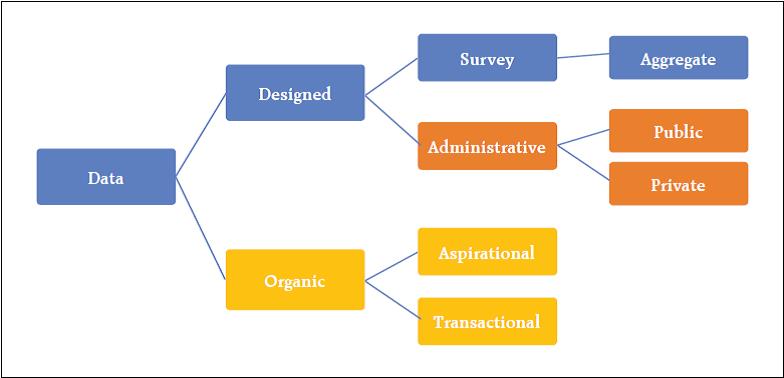 Organic data is the data that is generated by individuals without them noticing they are being surveyed. It is the data in the GPS of your phone, your searches on the web, the friends in your network, the things you purchase, etc. Every time any individual acts through any of these channels it provides information about herself. For example, very rarely, people ask a random question on Wikipedia. Usually the person is interested in the answer. That means that every search on Wikipedia tells something about the person searching. A tiny aspect of their personality. When you watch a movie in its entirety, Netflix knows that you are interested in that type of movies – or someone in your home is. Again, learning a small but relevant fraction of your inclinations. In other words, as Sandy Pentland says, with all these interactions, we are leaving breadcrumbs of our preferences. Therefore, we can take the bread crumbs and reconstruct a person – in the end learning something about that individual. It is like a survey but the person does not know it is being surveyed! In fact, the biggest advantages of organic data are that they are non-intrusive and the individual tends to be truthful in the data generation. We do not lie to our GPS, or to google, or try to manipulate Netflix. We leave a truthful bread crumb of our lives. I do not want to overstate, though. This is not the case for all the data sources. For example, in Facebook people do not show who they are, they show who they would like to be. Still it is informative about the persons ambitions, but not about what they are. So, there is a difference in the truthfulness that varies by their degree of aspiration versus transactions in the data source. The main problems of organic data, however, are the lack of representativeness and sample selection. Not everybody participates in the web pages equally. This implies that estimates and lessons obtained from the data are hard to extrapolate. Furthermore, the estimates are likely to be biased, and the models will be unstable and uncertain. Notice that, in my view, characteristics such as volume, velocity, and variety are irrelevant by themselves. They are only meaningful if they can be used to answer pertinent questions. In other words, the size of the data reduces the estimation error, but not the bias error. So, the researcher ends up estimating the wrong thing with higher precision. Again, the problem of lack of representativeness or sample selection makes model uncertainty a first order issue. Therefore, working with “big data” – or as I prefer to call it organic data – only solves the problem of precision. Biases due to misspecification, model uncertainty, and model instability are exacerbated. Two conclusions: First, because not a single type of data is perfect, I believe the methodology for future data collection entails a hybrid approach. We need to take designed data and combine it with organic data so the big data can be improved by the small data. In other words, use the small data, to correct for the biases generated by the big data. Second, as I said before, it is much better to imperfectly measure something relevant, than to continue to perfectly measure the irrelevant. In this talk I will present three examples on how we can improve some measures, and how we are combining data sources to do so. Billion Prices Project The billion prices project’s objective is to compute alternative measures of inflation. We use data from prices found on the internet to compute daily inflation rates. We started about 14 years ago using a procedure called ‘webscrapping’. In simple terms, the objective of webscrapping is to take the information presented in a standard web page and organise it in a database. See our paper (with Alberto Cavallo) in the JEP where we describe in detail how the indexes are constructed. We started with food in 2006. today, many sectors are extremely well represented on the web and we have expanded tremendously. In fact, a survey run by Price Water House Coopers in 2016 in 26 countries shows the willingness to purchase online. The penetration today is orders of magnitude the one we had 10 years ago. The table below summarises the answers averaged across all the countries, and the question is where they would prefer to purchase. I find the patterns fascinating. They have the information country by country. To compute an inflation rate we need two pieces of information: Prices and a basket. The basket is a collection of weights that intends to be representative of the consumption bundle of the country. Statistical offices collect the weights by performing consumer surveys – to determine how much is spent on tomatoes, onions, housing, education and iPhones. After they understand how those prices should be weighted, they collect data every month (in most countries) and compute the change in the cost of the basket. Prices can be collected in offline and online stores. However, from the online data collection perspective, there are three types of sectors. The ones where the information online is terrible; the ones where the prices online are representative and the weights collected by the statistical office provide a very good estimate of the consumption basket; and the ones where the data online is significantly better than the offline – especially the composition of products purchased. For example, education is terribly collected online – only the price of private tuition and some elements that affect the cost of education – such as uniforms and books – are collected online. Food is an example of the second type of sector. The share between tomatoes and onions is quite well collected by the statistical office. Hence, the weights come from high quality data. In food, the prices online – in several countries – are very representative. We can use the daily prices from the web to construct the inflation rate item by item and aggregate using the official weights. Finally, electronics is an example of the third type. We have iPhone X and 8 already in the market and most statistical offices are still collecting iPhone 7’s. In these sectors, we need to compute baskets and collect prices from online sources. For the sectors we have bad data, we make daily estimates of what the statistical office is likely to report – so, it is a forecasting exercise using daily web prices. For the second type of sectors we collect prices and then use the official weights (these are the simplest). For the third type of sector we make estimates of the weights by using the information presented on the webpages – certainly an error is typically introduced. Our inflation indices are not identical to the official ones. There are many reasons why they should differ. Two very intuitive sources: First, online and offline are different markets and therefore inflations should not be identical in the short run. Maybe similar in the long run, but certainly not in the month to month frequency. Online consumers tend to be richer, more impatient (younger), and the online market tends to be more competitive. Second, our procedures are also different – so, not surprisingly the inflation rates should also diverge. However, in the 14 years we have been computing daily inflation rates, it is remarkable how close they are to the official ones. In the next three graphs, the orange line is the official statistics CPI and the blue line is the online daily CPI. If we look at the US and the UK, the online and offline inflations are tracking each other quite nicely. Not all countries look like this. Indeed, we started with Argentina in 2007 because the statistical office was intervened in 2006. Our discrepancies with the official statistics during that time were very large. The cumulative official inflation in 9 years is 120 per cent, our data shows more than 640 per cent. Interestingly, since May 2016, when the new statistical office started computing the inflation rate without manipulation, the official and the online are close again (In this graph we needed to renormalise the official CPI to make it coincide with the online on May 2016 – however, after the renormalisation the two track each other). 120 versus 640 per cent! This is the size of the manipulation the Kirchner government taxed their citizens. Wages are indexed to the official inflation, pensions are indexed to the official inflation, but standards of living are affected by the real one. A 500 per cent expropriation entirely based on lies. I am glad the new government pivoted. 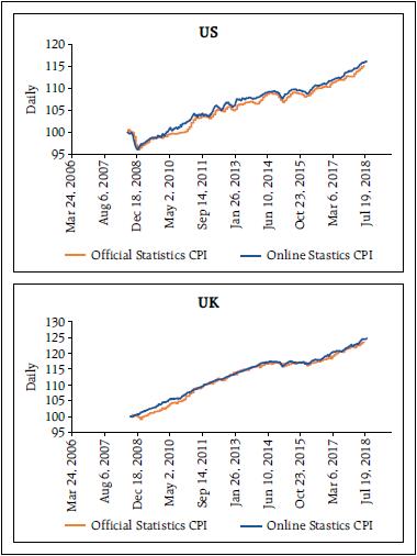
 Online prices can be used to gather the state of the economy faster and quite accurately. Furthermore, the online prices tend to move earlier than offline prices (the market is more competitive) and therefore, the online can be used as a leading indicator for the official releases. In developed nations that anticipation is about 2 to 3 months, while in emerging markets it is about 1 to 2. We have been producing inflation rates for about 20 countries. And I am very happy to disclose that we will have the inflation of India by the end of this year. Thousand Big Mac Indexes Let me move to the second project: trying to measure the real exchange rate or deviations on purchasing power parity. There are two standards in the measurement of PPP. One is a massive effort by the World Bank (WB) that puts 105 statistical offices together to produce the PPP adjusted measures. And then we have the big mac index from The Economist that is probably the simplest statistic ever created. Sadly, for the World Bank, the big mac is just as good as the PPP. There are many things to criticise about the Big Mac Index. Regardless of what you think about it, there is something brilliant in its simplicity. It is an identical item around the world. I know, nobody consumes it anymore, but it is the same item. The WB data has a big problem matching identical items. The advantage of the WB is that it has more than one item. But its cost and complexity makes it harder to interpret; and what is worse is that, it can render it irrelevant. Alberto Cavallo and I decided to produce something in between these two indexes: Our goal was to compare identical products worldwide that are actively purchased, and to base the index in more than one item. How do we do that? One very important piece of information in webpages is the item ID. For the same retailer (webpage), item ID’s uniquely identifies a product across different geographical locations – i.e. countries. It is better than the UPC or Barcodes code – because those codes are country specific. In fact, language specific – a bottle of coke in Canada has a different UPC depending on the packaging: French or English. Stores use these item id’s to manage their supply chain, and hence, treat identical items as such – identical – even if one has a Christmas label and the other one doesn’t. With these items id’s we can match and compare thousands of items worldwide. For example, two of the best webpages on earth – in terms of their transparency – are Zara and H&M – and I also like their products. So, for men, fast fashion, young, jackets, denim, we can find items in both stores in two different countries (I’m showing here US on the left, and UK on the right). We take taxes out and compute the ratio of the prices. That is the implied nominal exchange rate in the H&M jacket. After doing this for each item, then we pull thousands of those products, weight them within each category, and produce an index for the country. Voila, the big mac index in steroids. This index has several characteristics. It has no services at all, it has not a single non-tradable product, and almost all the goods are traded internationally. Furthermore, these are actually items people purchase. Think about electronics, clothing, personal care, gasoline, etc. Those are the items in our index. In the figure below, I am showing the UK-US indexes. The purple line is the nominal exchange rate (from financial markets); where a decline implies a depreciation. The green line are the relative prices (US divided by the UK). Hence going down implies that the inflation rate of the UK is larger than the inflation rate for the US for this set of identical tradeable products. Two things to realise. first, before Brexit, it is remarkable how closely related the two lines are. In fact, it is hard to tell what is causing what… During that time there were large fluctuations of the exchange rate (more than 10 per cent) and retailers followed those trends closely. Second, interestingly, that pattern changed in Brexit. The figure to the right is just the indexes since the Brexit vote. There is a large depreciation (in June with the Brexit vote, and in October when Theresa May says she is going to invoke Article 50) but retailers in UK do not increase prices faster than in the US. Why? Two possible explanations: either consumers were very aware about the possible consequences of Brexit in terms of inflation and were unwilling to accept price increases (there is evidence of this on the Toblerone case) or the demand is so weak that it cannot sustain a price increase. In both cases, a large gap is created. Because the demand for importables (most of these items are imported) is lower, there needs to be a current account improvement (which indeed occurred) and there has to be an appreciation of the nominal exchange rate (which as can be clearly seen, it did happen). We are not predicting anything here. We are just measuring the state of the aggregate demand for imports in the UK relative to the US. It happens, and most economic models would predict, that such shifts in demand need to have an impact on the current account and on the exchange rate. We have only nine countries so far, but more will come. Aggregate Confusion Project Finally, my new project is about measuring ethical behaviour of firms: it is called the aggregate confusion project and it is joint work with Julian Koelbel and Florian Berg. This is just starting (2 to 3 years going). For more than a decade, financial markets have been interested in understating the impact firms have on several dimensions environmental, social, and governance (ESG). The reason is that investors would like their investments to have a positive impact on society. This has created a proliferation of data providers with the intention of measuring the behaviour of firms. These data providers, however, have produced incredibly inconsistent ratings. For example, in the figure below we show the exact same firm rated by two of the top ten rating agencies of ESG. As can be seen, the correlation is positive but small (less than 30 per cent). 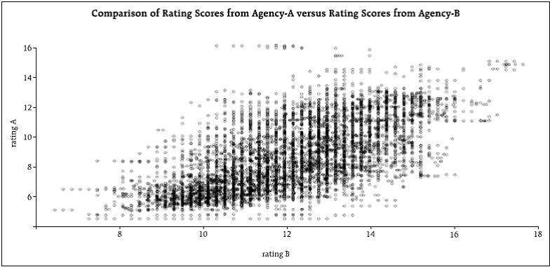
 What is the source of the discrepancy? For that purpose, we took the raw data from several of the rating agencies and reverse engineered their rating processes. We disentangle the errors in three sources. First, we created a taxonomy of the attributes that supposedly should be measured. For example, CO2 emissions, water management, labor practices, women empowerment, board composition, etc. We then assigned the different indicators to the categories or attributes. The first step was to understand what is the discrepancy among those indicators that are supposed to capture the same attribute. We call this ‘measurement error’. Once we have compared the common attributes, we noticed that rating agencies pay attention to different attributes. It is possible that one rating agency does not even measure an attribute. This of course creates a discrepancy. We call this source “information set error”. Finally, we look at the different rules of aggregation and those can also be causes of discrepancy. This is identified with “aggregation error”. Once we look into the data and decompose the discrepancies among four rating agencies we found that about 70 per cent of the error is coming from measurement, 25 from information set, and 5 from aggregation rules. These are still preliminary results. The final goal is to be able to produce better measures of ESG that are open and can be used by all. Some Lessons To end, let me summarise some lessons I have learned from dealing with these alternative data sources. Hopefully, these are valuable lessons for central bankers. First, the biggest advantage of the organic data is its truthfulness. Not its size, speed, variety, etc. It is the fact that people tend to answer in a truthful way, what I think makes this data unique. In this regard, collecting data that is transactional as opposed to aspirational increases the information value of each observation. So, credit card transactions or GPS locations are far more meaningful that the tweets or the Facebook status. Second, the organic data is not ordered along geography or socioeconomic conditions. It is organised by behaviour. We have been collecting surveys for millenniums (literally) by paying attention to geography and social conditions, statistical offices have that paradigm as a guiding framework to understand the economy and society. I think this view will be challenged. Third, the biggest disadvantage of the organic data is the fact that it is not representative. It is impossible to generalise – although people love to generalise the correlations computed in these data sources. The combination of non-representativeness and extremely large data sets is a dangerous one. People estimate horrible regressions with extreme degrees of precision. It is important to emphasise something that is trivial – but usually forgotten. The size of the data reduces the estimation error, but not the bias! Fourth, when the data is nearly in real time, even when aggregated, it can entail massive violations of privacy. We need to be aware of these problems because we have never encountered them. We have felt safe in our quarterly estimates of the aggregate. When that changes to daily estimates of a sub-set, our concern for privacy needs to be heightened. Finally, are the new data sources going to substitute statistical offices? No. No chance. It will force them to change, but not to disappear. The future of the statistical offices is one in which there will be a hybrid approach. Part of the data will be collected using organic data, and part through surveys. And very importantly, the surveys are going to be used to correct the inherent biases of the organic data. In sum, the small, slow, but representative data will be used to fix the large, fast, but non-representative one.
|